Private lease
we created a website for Mazda Netherlands with excellent interaction to offer users the best possible experience when ordering a private lease car online.
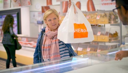
Leasing a Mazda privately is now easy and fast online via privatelease.mazda.nl. For Mazda Nederland we created a website with excellent interaction for the best possible experience. As an end user, you are completely unaware that there are many underlying APIs communicating while you order your new car.
Mazda Netherlands wanted to be able to sell their cars online via private lease. We started working together with Mazda and design agency Morrow, with whom we previously built the successful Car Configurator. The website would offer a few choices to assemble the car, but it would mainly consist of a form.. But how do you make a form sexy and also accessible to everyone? We opted for best-in-class interaction for an optimal experience of the ordering process.
We started by asking ourselves what makes a nice form. We liked the simplicity of Typeform that shows one question per screen. You can easily navigate to the next question with your keyboard. But where Typeform works well with surveys, we noticed that it works less well for forms. Our contact form would not consist of isolated questions, but of fields that have a certain connection. Pulling those questions apart felt illogical and inconvenient.
So we eventually opted for a simple, self-built form with separate steps for name fields, address fields and telephone number. A form that you as a user can freely navigate through, receive relevant feedback and where at the end it is checked whether you have filled in all fields.
The entire form can be operated with the keyboard. In addition, we have retained all native HTML elements. As a result, the accessibility of the website is covered. Even on mobile it works great, which is often not the case with online forms. It is therefore a very pleasant experience for an end user. Not least because we have built one central API for the six external APIs that controls those six other APIs. As an end user, you therefore do not notice the underlying processes. And we like that: reducing a complex infrastructure to an elegant and user-friendly website or app.
User-friendliness is in the details. Even - or especially - with something as simple as an ordering process. So we thoroughly tested the go-live website during our bi-monthly Real User Mornings. One of the main conclusions of this usability test was that many users needed more guidance. After all, leasing a car is a big step.
We have also been able to improve the completion of the ordering process thanks to our usability test. The last screen should be a party: you ordered! Yet that screen was perceived as unclear. By providing more information about the next steps, the end user now has the feeling of being able to click the screen closed with peace of mind.
By explaining more, offering fewer choices and clarifying texts, the site became even better!